About the project
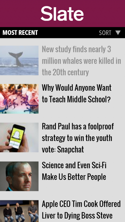
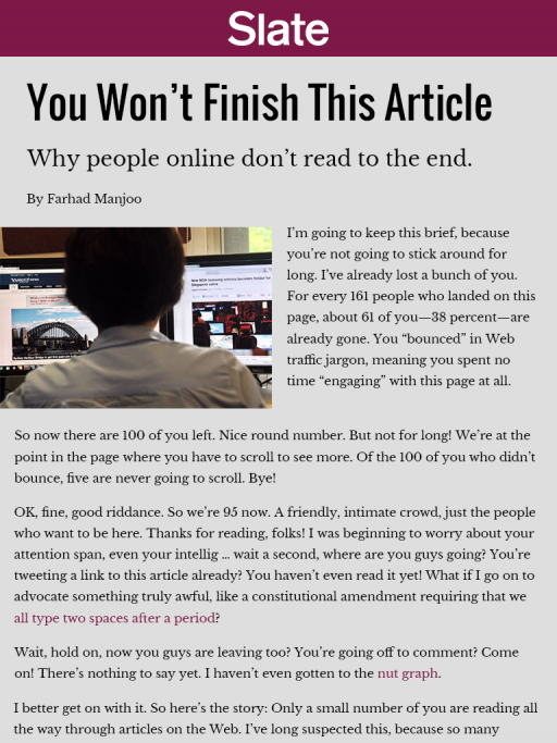
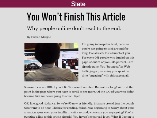
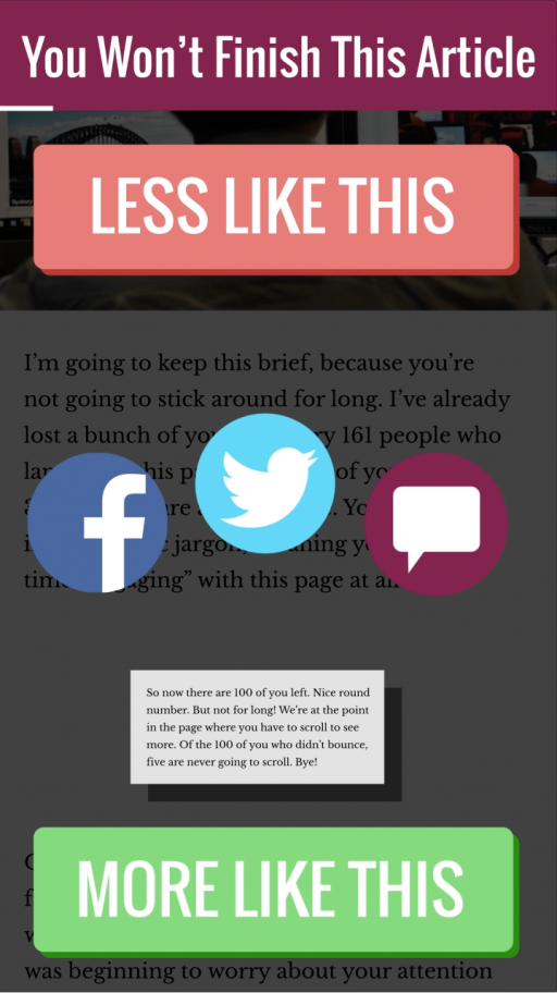
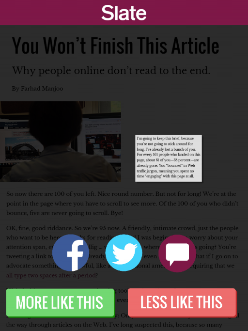
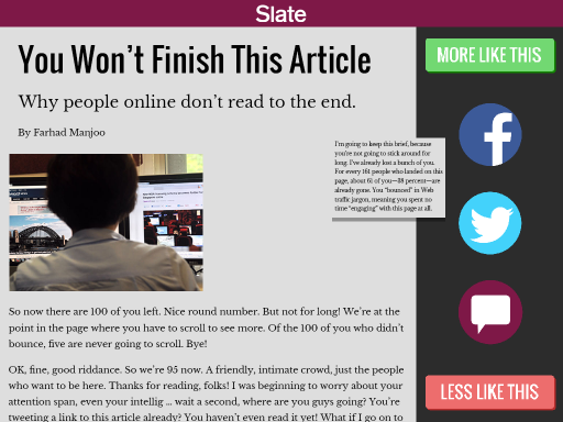
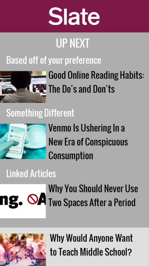
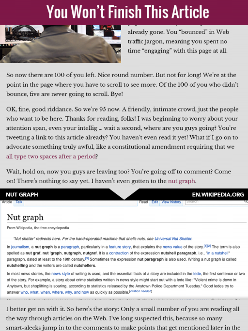
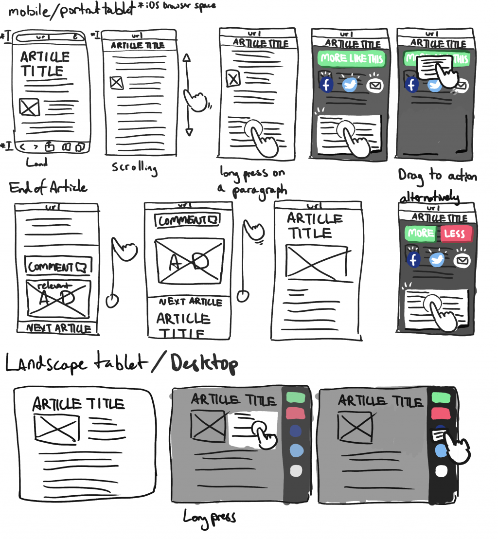
This project aimed to create a focused experience for news readers. I took a look at Slate’s mobile news reader, and designed a reader that allows people to remain focused on the article they are reading, while retaining ad space to enhance Slate’s ad revenues. I also added the functionality of dragging paragraphs to “More Like This” and “Less Like This” buttons, so the suggested articles become more personalized.
Client
- Project for Advanced Web Design at Carnegie Mellon University
-
SPRING 2015
Tools
Photoshop, After Effects
Design Solution
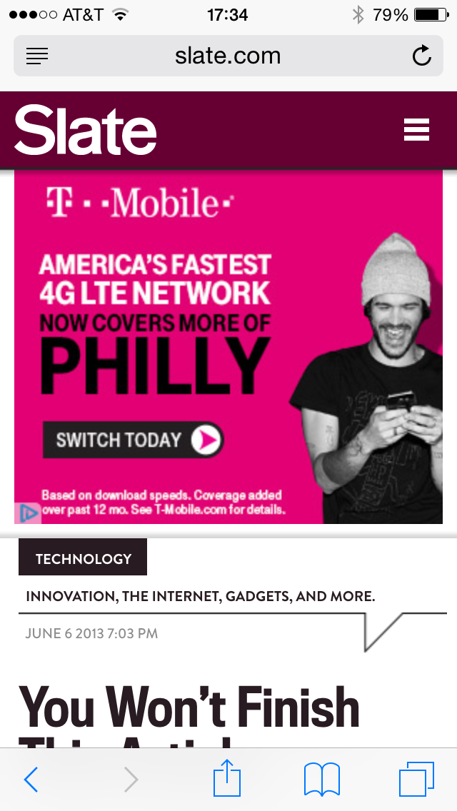
Ads Are Distracting
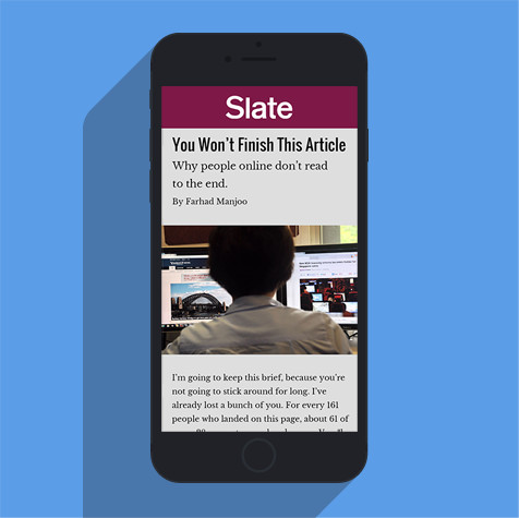
Slate’s current mobile reader shows ads at the top of the article, creating a disorienting experience for the reader.
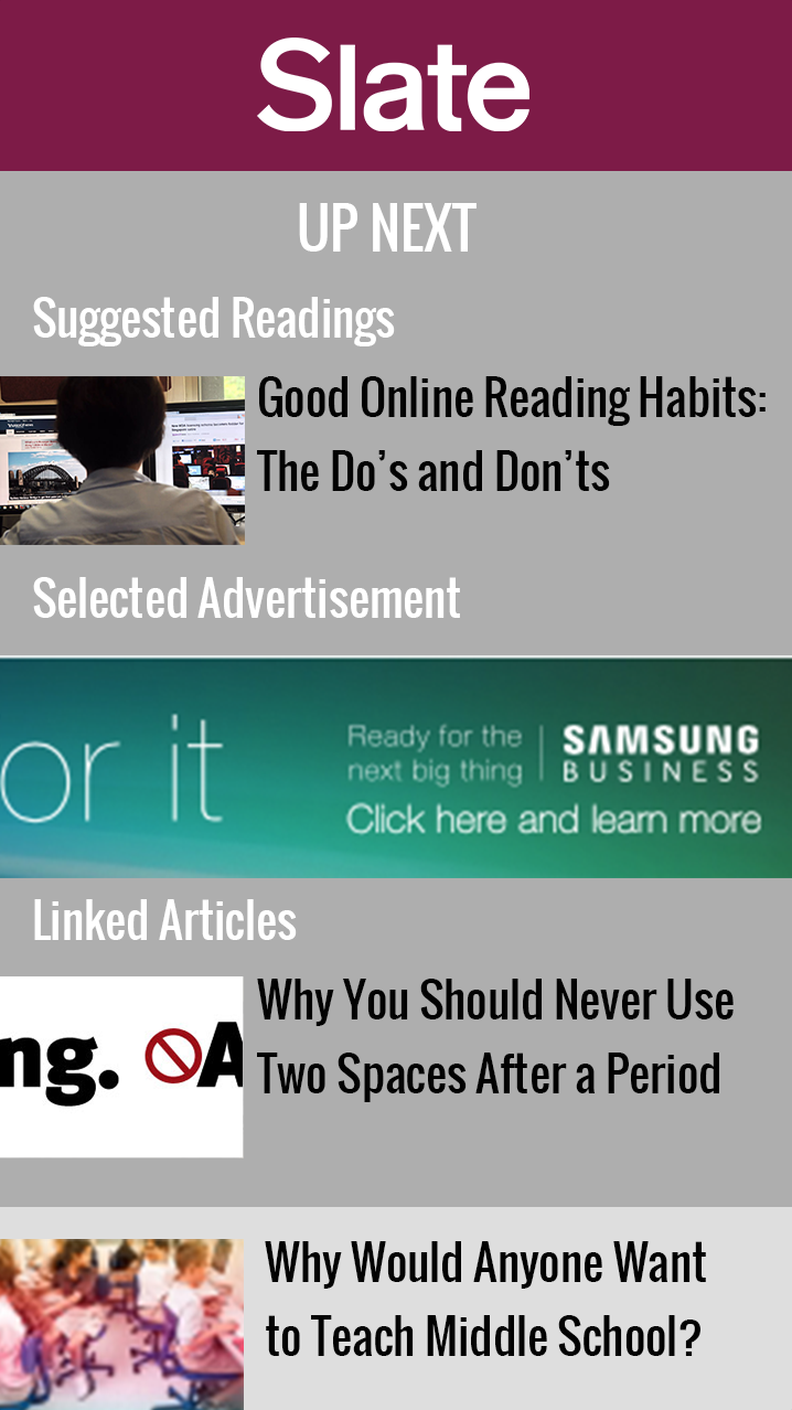
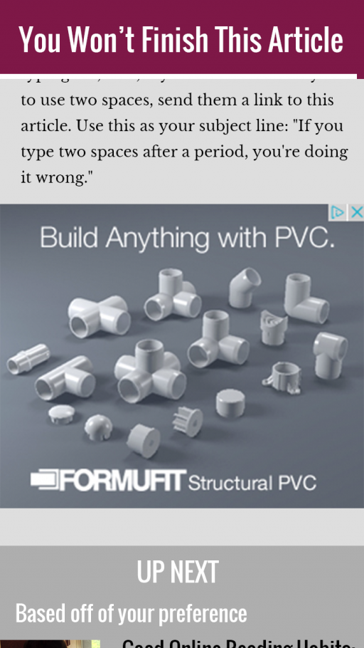
Recommended Ads
Recommended ads appear during and after articles, displaying products that relate to the reader’s interests.
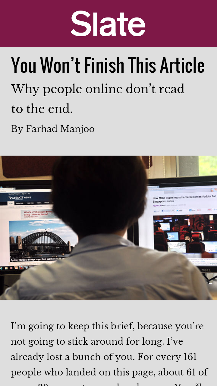
A Streamlined Experience
The new visual hierarchy allows the reader to focus on the content of each article, with the ability to share and save important snippets.
